Return to the Course Home Page
Transcriptomics
Dr Olin Silander
Learning Objectives
- Understand the purpose of dimensional reduction techniques
- Understand why dimensional reduction is useful for analysing large datasets
- List three common methods for visualising RNA-seq data (volcano plot, heatmap, and dimensional reduction - PCA/UMAP/tSNE)
- Explain the differences between each of the above visualisation methods
- Explain the insights that dimensional reduction can give for RNA-seq data
- Perform the steps necessary to implement dimensional reduction on a dataset
- Interpret dimensional reduction plots
- Discuss the advantages and disadvantages of two common dimensional reduction techniques, PCA and UMAP.
- Explain the requirements for read mapping in RNA-seq and interpret the results.
Introduction
Today’s plan
A flowchart of today’s lab is below.

Two different activities today
Dimensional Reduction
As we have learned throughout the Semester, a key aspect of data analysis is data visualisation. However, working in genomics, we often have extremely complicated data, and coming up with ways to visualise it in an intuitive yet objective manner is hard.
For example, last week you visualised differences in microbiome content based on hundreds of bacteria across tens of microbiome communites. How should we do this if we have tens of thousands of genes (i.e. variables) and tens of thousands of samples? We need to have an effective manner of reducing the number of variables so that we can visualise only one or two. How should we reduce the number of variables?
We will use dimensional reduction techniques. In this way we can objectively reduce tens of thousands of variables into combinations of variables so we can focus only on the one or two (or three) most important (combinations) of variables and determine which of our samples are most similar or different on the basis of these combinations.
Dimensional reduction is an important technique. In fact when you have any biological samples that have a large number of variables, e.g.
- microbiome samples with hundreds of different bacteria (as you did last week)
- genotype data for individuals with hundreds of different SNPs
- gene expression data from cancer samples for hundreds of different genes
- genotypic data from hundreds of dogs to predict breed, height, and weight.
I would argue that after dimensional reduction is the single most important technique you can apply for visulisation of data with many variables (i.e. matrix columns in the cases you have encountered previosuly). Here, we will focus on two main methods: Principal Component Analysis (PCA) and UMAP.
Before reading further, please take five minutes and read this quick intro to PCA before continuing.
Becuase this is such an important concept, we are going to spend some time on this. First some examples that have nothing to do with RNA or cells or sequencing. But hopefully they give us some insight into how dimensional reduction works and why it’s important.
Important Note: I have put some extremely informative (imho) youtube videos up on Stream that explain PCA, UMAP, RNA-seq normalisation, and from there you can find explanations on other RNA-seq related topics. Also linked here:
Explain PCA
Explain PCoA and MDS
Explain UMAP
Explain RNA-seq
Explain FPKM and TPM
The Meat and Potatoes
To gain some initial insight into PCA we will consider a food dataset from the UK. This is shown below. The dataset shows the consumption (in grams) per person per week of each of the foodstuffs.

Yummy
Our aim here is to find out which of these countries 😬 differ the most in their diets. But of course diets are not one food or two foods, they are combinations of all foods. So which of these countries differ the most in the combination of all these foods?
We can already see that consumption of some types of foods differs more than others. For example, cereal consumption varies by about 5% between all countries. However, Welsh people drink more than 3.5 times as much alcohol than Irish people (Northern Irish).
We can visualise food consumption as a heatmap (here I have used the heatmap.2 function in R), which plots the same information, but more compactly. At the top of the heatmap is a dendrogram, which indicates how similar the countries are using Ward’s method. The dendrogram can be interpreted a little bit like a phylogeny, with the most closely “related” samples connected by the shortest “branches”. N. Ireland appears the most different, while England and Wales appear the most similar.

It’s getting hot in here
In contrast to a heatmap or barchart, PCA will help us to figure out which countries are the most similar or different in their combined diet. This is because PCA finds the combinations of diet items (components) that vary the most between countries. We can then take these components and plot them. Below, I show the first two components (Dim1 and Dim2) - these are the two most important components, although there are a total of 17 components (the same as the number of variables). Clearly, Wales and N. Ireland differ the most in the combinations of items in their diets (the “components”). I have made the x-axis (Dim1) approximately three times longer than the y-axis (Dim2), as Dim1 accounts for approximately three times more variance (68%) than Dim2 (25%).

England is central to it all
Not only that, we can visualise which combinations of diet items contribute to those components. The top four items that contribute the most to these principal components (Dim1 and Dim2) are shown below. This plot is the same as the one above (although not lengthened along dimension 1), but instead of showing how much the countries differ in their diet combinations, it shows which parts of the diet contribute the most to making the countries different. Here, this is the top four, with sugars contributing the most to the differences in the direction of Wales, fresh potatoes contributing in the direction of N. Ireland, and alcohoic drinks in the direction of Scotland and Wales.

What are “other veg”, Wales?
Now we can see that Dimension (Component) 1 consists primarily of sugars and other_veg (and a bit of alcohol), all of which the Welsh consume more of – especially compared to N. Ireland. Dimension 2 consists primarily of the Irish tendency to eat a lot of potatoes (with some avoidance of alcohol). But perhaps most importantly, we have shrunk our 17-dimensional dataset to two dimensions that account for 68.3 + 24.9 = 93.2% (!) of the variance in the original 17 dimensions.
We can double check our results here by returning to the barchart. In this case we find, as expected, that N. Ireland consumes less alcohol.

Probably lots of those cool alcohol-free seltzers.
Okay, let’s repeat this ourselves, with a new dataset.
Hold my beer - Increasing Sample Size and Dimensions
We will move on to a cocktail dataset and a tutorial derived from here and here.
At this point, open your terminal.
Next, download the data from here. The address should be: https://osilander.github.io/203.311/Week11/data/all_cocktails.tab. If you have forgotten how to do that, ask your neighbour.
Navigate to your RStudio tab and read this file into R. Use the read.table() function to do this. Ensure that you use the header=T argument and assign it to a reasonably named variable (you can choose, but note that this is a dataset on cocktails. Or, for simplicity you can name it cocktails_df (as that will match the code below).
We now have a dataset of cocktails and their ingredients. Take a look at the dataset, for example with head or summary.
Next we need to load a few libraries before we do our first analysis. This will take about three minutes, so sit back for a second.
# it's the tidyverse!
install.packages("tidymodels")
library(tidymodels)

# it's for cats!
install.packages("forcats")
library(forcats)

# it's an obscure stats package!
install.packages("embed")
library(embed)

# it's a famous plotting package!
install.packages("ggplot2")
library(ggplot2)

# for pipes
install.packages("magrittr")
library(magrittr)
Now we start on the path toward cocktail PCA.
# This is a recipe
# We don't really sweat the details
# WIn a rare breach of rules,
# we just paste the code (*all* of it)
# But I put comments in if you're curious

# Tell the recipe what's happening but have no model ( ~. )
pca_rec <- recipe(~., data = cocktails_df) %>%
  # Note that the name and category of cocktail
  # are just labels not predictors
  update_role(name, category, new_role = "id") %>%
  # Normalise so all the
  # variables have mean 0 and stdev 1
  # note that the %>% thing is the *pipe*
  # operator and performs similarly to the
  # pipe | in the terminal
  step_normalize(all_predictors()) %>%
  step_pca(all_predictors())
# Actually do the PCA by "preparing"
# the "recipe"
pca_prep <- prep(pca_rec)
# and a smidge of tidying
tidied_pca <- tidy(pca_prep, 2)
Phew.
Now we can visualise the results. First, let’s take a look at the first two principal components. Remember, these are the combinations of ingredients that contain the most variance (in other words, what combinations of ingredients differ the most between cocktail drinks).
Below we use the ggplot plotting package. This uses the idea of a grammar of graphics and is among the most popular plotting methods in R. Some of you have already encountered it.
# juice gets the results of the recipe
# and feeds it using %>% to the plotting function
juice(pca_prep) %>%
# the plotting, include the cocktail name
  ggplot(aes(PC1, PC2, label = name)) +
  # make the points colored by category
  geom_point(aes(color = category), alpha = 0.7, size = 2) +
  # add text
  geom_text(check_overlap = TRUE, hjust = "inward", size = 2) +
  # and don't add more colour anywhere
  labs(color = NULL)
Note that you can change the PC1 and PC2 in the ggplot function to
plot the next principal components. Feel free to try this (e.g. to plot PC2 and PC3).
Wow, a few cocktails are very different from others. What’s in an Applejack punch?
# we have a cocktail of interest
my.cocktail <- "Applejack Punch"
# Let's find the ingredients and assign it to a variable, "ingredients"
# You should be able to see what the code below is doing
# If not, it is getting the *rows* from the matrix
# cocktails_df in which the variable in the column $name
# matches == your cocktail of interest. So it total:
# cocktails_df$name==my.cocktail.
# We want the rows and *all* the columns in those rows, so use
# cocktails_df[row.of.interest, ]

ingredients <- cocktails_df[cocktails_df$name==my.cocktail,]
# Now we can see the ingredients
# What is this code doing? It has a new method, which()
# that we use to only report the ingredients that are
# greater than 0 (i.e. they're in the cocktail)
cocktails_df[cocktails_df$name==my.cocktail,which(ingredients>0)]

# repeat the above steps but with a
# cocktail of your choice, or, for example, this one:
my.cocktail <- "Sphinx Cocktail"
Not only can we say which cocktails are most different, we can see which are most similar. This would help us suggest new but similar drinks to customers, for example if you were bartending.
# Here, we choose a couple of cocktails to look at
# You can choose these or different ones
# We select these as they're similar
my.cocktails <- c("Silver Fizz", "Peach Blow Fizz")
# Another new method, the *for* loop
# we repeat the same as above, but
# "loop" over all values of the my.cocktails vector above
# of course here, coi means "cocktail of interest"
# for each coi, we get the ingredients and print them
# to the screen
for(coi in my.cocktails) {
  ingredients <- cocktails_df[cocktails_df$name==coi,]
  print(cocktails_df[cocktails_df$name==coi,which(ingredients>0)])
}
So similar yet so different.
Finally, we can discover which variables are contributing the most to each component (as we did above). This time we will plot it slightly differently, again with ggplot (and credit to the tutorial here). Let’s remember what this is doing: we are finding the sets of variables (i.e. ingredients) that differ the most between all cocktails.
# No issue here with breaking the rules
# and copy-pasta
tidied_pca %>%
  filter(component %in% paste0("PC", 1:5)) %>%
  mutate(component = fct_inorder(component)) %>%
  ggplot(aes(value, terms, fill = terms)) +
  geom_col(show.legend = FALSE) +
  facet_wrap(~component, nrow = 1) +
  labs(y = NULL)
So what have we discovered? We have hopefully found that dimensional reduction is a powerful method to let us determine what variables (or, combinations of variables, e.g. diet items or cocktail ingredients) differentiate samples (e.g. countries or cocktails). We can use this to objectively determine which samples are the most similar, and which are the most different. We can also determine which (combinations of) variables are most responsible for making these samples different.
But enough of that, onwards and upwards (hopefully).

Even so, we will go upwards.
Who map? UMAP
A second commonly used method for dimensional reduction is UMAP (Uniform Manifold Approximation). UMAP is not as easy as PCA to understand from an algorithmic point of view. It is, however, an extremely powerful method for reducing dimensions while preserving the original structure of the data (i.e. the relative relationships and distances between samples). However, there are some people that have recently argued against the utility of UMAP. I personally think there is still great insights to be had, but they are very much qualitative and not quantitative insights.
Please take a couple of minutes to browse this site. Scroll down to the Woolly Mammoth and adjust the parameters. Specifically, try n_neighbors = 100 and min_dist = 0.25.
Okay, let’s go through this quickly just so we can compare to our previous results. We make almost exact the same recipe as before:
# feel free to cut and paste, this is all correct
umap_rec <- recipe(~., data = cocktails_df) %>%
  update_role(name, category, new_role = "id") %>%
  step_normalize(all_predictors()) %>%
  # this is the different step, where we use the step_umap function
  step_umap(all_predictors())

umap_prep <- prep(umap_rec)

umap_prep
And juice our results to plot it.
# copy pasta, no typos here
juice(umap_prep) %>%
  ggplot(aes(UMAP1, UMAP2, label = name)) +
  geom_point(aes(color = category), alpha = 0.7, size = 2) +
  geom_text(check_overlap = TRUE, hjust = "inward", size = 2) +
  labs(color = NULL)
Woah. Compare this to the previous PCA result. What is different? Although both of these methods have the same goal - dimensional reduction - you can see that there are very different results. Here we can see that UMAP does not aim to find which variables differentiate samples the most (which PCA does by stretching some dimensions considerably and shrinking others).
Rather, UMAP aims to find ways to reduce dimensions while maintaining groupings. If we consider the Woolly Mammoth example from the link above, PCA would find that the variable with the most variation is (largely speaking) length and width. It would then project onto these, leaving differences between the left and right side nearly non-existent. You canimagine, for example, that the two tusks would thus become indistinguishable. However, this is not at all true for UMAP. It would group each tusk (as they are near to themselves) but keeps them separate. Similar for the left and right legs.
A second difference between the two methods is that PCA is better suited for datasets in which there are a small number of variable-combinations that differentiate samples (e.g. when the first three principal components accounts for 90% of the variation of the data). In contrast, UMAP is better suited for datasets in which there are many many variable combinations that differentiate samples.
RNA-seq
The Data
Now we can begin our RNA-seq journey. To do this, we will begin at the beginning, with some RNA-seq reads from human samples. These are from here. This address should be: https://osilander.github.io/203.311/Week11/data/fastq.data.tar Let’s make a fresh directory for this analysis, perhaps rnaseq. Do that, change into that directory, and please download the RNA-seq reads now (wget). Note that this is a subset of the data from the tutorial here.
Let’s first untar the tarball so that we see the files inside.
# -x extracts -v is verbose -f is the file
tar -xvf fastq.data.tar

# upon successful untarring, remove the tarball!
rm fastq.data.tar

You’re lucky I told you the command.
If you look at the names of the .fastq files, you will see that some are called “HBR” and some “UHR”. The HBR reads are from RNA isolated from the brains of 23 Caucasians, male and female, of varying age but mostly 60-80 years old. The UHR are from RNA isolated from a diverse set of 10 cancer cell lines.
Let’s next check the that .fastq files look as we expect. Use your trusty friend, seqkit.
Next, let’s do a quick QC step. Before, we used the comprehensive QC tool fastp. This is an excellent tool as an all-in-one QC and trimmer. Now we will use fastqc and look at a report generated by multiqc for rapid QC assessment
We can do a quick install:
# all at once
# might briefly redline your RAM
mamba install -c bioconda fastqc multiqc
Now we run the QC steps
fastqc *fastq

# it can't be this easy, can it?
# you wouldn't cut and paste this, would you?
mu1tiqc .
This will make a lot of files. Scroll and find the multiqc report .html. Go ahead and click on the multiqc report file. (Open in your browser.) For each of the .fastq files we can see a summary of its statistics. Note that there is a clickable menu on the left, and a toolbox available on the right (click the “toolbox” tab). The toolbox allows you to do things like colour samples by group or hide specific samples. We will not worry about that. However, one important statistic we can see is that there a lot of sequence duplicates. 🤔 Why would this be? What kind of data is this? Would you expect duplicates? Why or why not? Should we consider removing these duplicates?
We are not going to worry about the adaptor trimming step of QC, as I have already done this for you. However, under normal circumstances not doing this could be fatal for your pipeline.
Alignment
The human genome is three billion base pairs long (the haploid version). Clearly we cannot take the reads from above and map them to this genome as you will not be able to handle this genome in the memory of your RStudio instance. Instead, then, I have extracted 500 Kbp from chromosome 22, and we will deal only with this region. You can see this region here - yes, clickme.
The webpage you were just on (or are about to go on) is the Santa Cruz Genome Browser, one of the primary repositories for reference genomes, with many of the genome features hand-annotated. Here, you can see a region from human chromosome 22 (visible at the top of the screen, with the focal region in a red rectangle). In an extreme stroke of luck, this region also has genes in it. (Kidding, I made sure it did). These genes are visible as dark blue / purplish annotated elements, and are clickable if you’d like to see more details.
You can also see several other “tracks” toward the lower part of the page. The first are labeled OMIM, which are locations of known genetic changes that cause human genetic diseases. OMIM stands for Online Mendelian Inheritance in Man.
After that are several other tracks, for example one labeled IGLV2-14. Click on this. You will see it leads to a data page containing information on where this gene tends to be expressed.
The .fasta file of the extracted region from Chromosome 22 is here. Go ahead and download it now (yes, wget). That address should be https://osilander.github.io/203.311/Week11/data/human-GRCh38-22sub.fasta
We now need to map our reads. What should we use? Well, you have mapped reads before in the lab in which we reconstructed SARS-CoV-2 genomes. We can repeat that here.
# it's our trusty friend bwa mem
# let's index first
bwa index human-GRCh38-22sub.fasta

# now map the first UHR read set
# the first argument is the reference to map against
# the second two arguments anre the read files
# and output is to a .sam
bwa mem human-GRCh38-22sub.fasta UHR_Rep1.R1.fastq UHR_Rep1.R2.fastq > UHR_Rep1.bwa.sam
Great. Let’s take a quick look at our results.
# samtools is so versatile
samtools flagstat UHR_Rep1.bwa.sam
Look specifically at the “Supplementary reads.” What are these? Click here to find out: split read is a conceptual name for the situation, that your read is broken in 2 parts. And to say it is a split read you have a bit wise flag of 0x800 marking supplementary alignment
Why do we have these Supplementary reads? Did you forget something? We are looking at RNA-seq data. RNA-seq data is from mRNA, which is often spliced. So we need a splice-aware aligner!

Yes, you do.
# here's a splice-aware aligner
mamba install -c bioconda hisat2
# first we make the index. The second argument here is the base-name of our index
hisat2-build human-GRCh38-22sub.fasta human-GRCh38-22sub

# then we map. These arguments should be relatively self-explanatory
# -x the reference; -1 the first read; -2 the second read; -S the Sam file
hisat2 -x human-GRCh38-22sub -1 UHR_Rep1.R1.fastq -2 UHR_Rep1.R2.fastq -S UHR_Rep1.hisat2.sam
# samtools is so versatile
samtools flagstat UHR_Rep1.bwa.sam
# then the hisat version to compare
samtools flagstat UHR_Rep1.hisat2.sam
Note the differences between the two .sam files.
# let's remove this pesky bwa alignment
rm *bwa.sam
# and the hisat2 alignment (trust me)
rm *hisat2.sam
We have just seen that there are no Supplementary reads in the hisat2 .sam file, and thus we have successfully mapped across the exon junctions. However, we have six different read sets here and would like to map them all. We could go and map each one of them by hand. But we are operating on the command line and would like to do things a little more quickly. In this case we will use a bash loop, a slightly complicated format but one which can help tremendously when you have hundreds of files. I have written it out below. If you have not used the same file names as the ones listed above, then the loop won’t work. Let someone know if this is the case.
This is a difficult bit of code to understand. I have put plenty of comments in. However, to execute this you need to type all the code part at once. You can copy paste this.
# the F here is a variable that we loop over
# We'll also sort
# With some careful examination you should
# be able to understand what is happening here
# first line uses the for loop, recognises all R1 fastq
# using the wildcard * symbol, and then says "do this"
for F in *R1.fastq; do
# second line maps with hisat2 on the fastq file
# we're currently looping over ($F) while simultaneously
# substituting the suffix .fastq with .sam
    hisat2 -x human-GRCh38-22sub -1 $F -2 ${F/R1/R2} -S ${F/R1\.fastq/sam};
# last line sorts the output sam from hisat and outputs this sorted
# data into a new bam labeled "sort.bam"
    samtools sort ${F/R1\.fastq/sam} > ${F/R1\.fastq/sort\.bam};
# we tell it we are done with our loop
done
You should now be able to see six new .bam files in your directory. You can easily check this using a wildcard: ls -lh *bam. You can immediately see that the Human Brain datasets have fewer mapped reads (the files are much much smaller). Finally, we can take a look at the depths.
# This should work, an example is below if it doesn't
samtools coverage -m bam.file.of.your.choice.bam
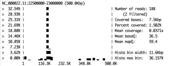
Example.
Take a look at all the replicates for each sample. Do they look the same? You can return to the UCSC browser page to see how the plots here relate to the gene locations on the chromosome. Remember that the region you have mappoed to is a small part of chromosome 22. Specifically, it’s from 22.5 Mbp to 23 Mbp. Thus, on your samtools coverage plot, position 150 Kbp will be 22.5 Mbp + 150 Kbp = 22,650,000 bp.
There are clearly specific genes that are almost completely turned off in the brain. Which are those?
Look also at UHR_Rep2.sort.bam. There is something slightly funny going on with this sample. What is different about this sample? More importantly: How could this happen? To understand this we have to remember how RNA-seq is done, and most importantly, what the input biological material is. What is the input material for our sequencing experiment? What transformation do we have to do to this material before sequencing? Are we actually sequencing RNA or DNA? Think carefully about this, as it is the key to your Portfolio Analysis.
Portfolio Analysis
Often we are interested in the distribution of coverage (i.e. depth) values for an RNA-seq dataset so that we can look for specific artefacts or problems with our data (see Figure 5 here for an example of such a plot). In this case, “distribution” simply means a histogram or density plot. For this portfolio analysis, you will need to calculate and plot such distributions (histograms or density plots or even violin plots) of coverage (i.e. depth) for all six samples for which you now have .bam files. Plot these in such a way that these distributions are easy to compare, and thus easy to check for problematic samples. This could involve any of a number of manipulations or plotting methods, and I leave this to you. Carefully consider what sort of pattern could indicate a problem, and why that problem could occur. This may help in deciding how to visualise or compare your data.
Remember that there are more decisions to make than just “plot a histogram(s)”. You need to decide on the x-axis limits, the number of breaks (i.e. thin bars or thick bars), the type of x-axis, the y-axis limits, the type of y-axis, whether you want bars or lines for the histogram, if a density plot is better, or maybe even a violin plot, whether it should be shaded or couloured, etc.
Next Time
Next time: What about volcanoes? And heatmaps? And the Poisson?

Unfortunately we won’t be able to look at scRNA-seq data. We’ll save that for your writing assignment.