Return to the Course Home Page
Introduction to Visualization
Professor Murray Cox
Purpose
Introduction
A Basic Scatter Plot
Different Types of Graphs
Making Good Use of Summary Statistics
Choosing A Plot Type
Critically Evaluating Your Data
Checking Your Data Source
P Hacking
Take Home Messages
Further Reading
Purpose
To learn how to critically explore data, with the aim of designing and making clear, simple and informative graphs.
Introduction
Conveying quantitative information in graphical form sounds easy. Perhaps surprisingly, it isn’t. A large number of studies dating from the 1960s onward show that what data you use and how you present it really matters. People can interpret graphs of the same data in very different ways solely because of superficial choices like axis ranges, plot types, color schemes and other seemingly unimportant features. Interpretation can also be influenced by more fundamental issues with the data. In this practical, we will explore some basics of thinking critically about data and good graph design. We will make graphs for a number of different datasets, and in the process, we explore some examples of good and poor practice.
A Basic Scatter Plot
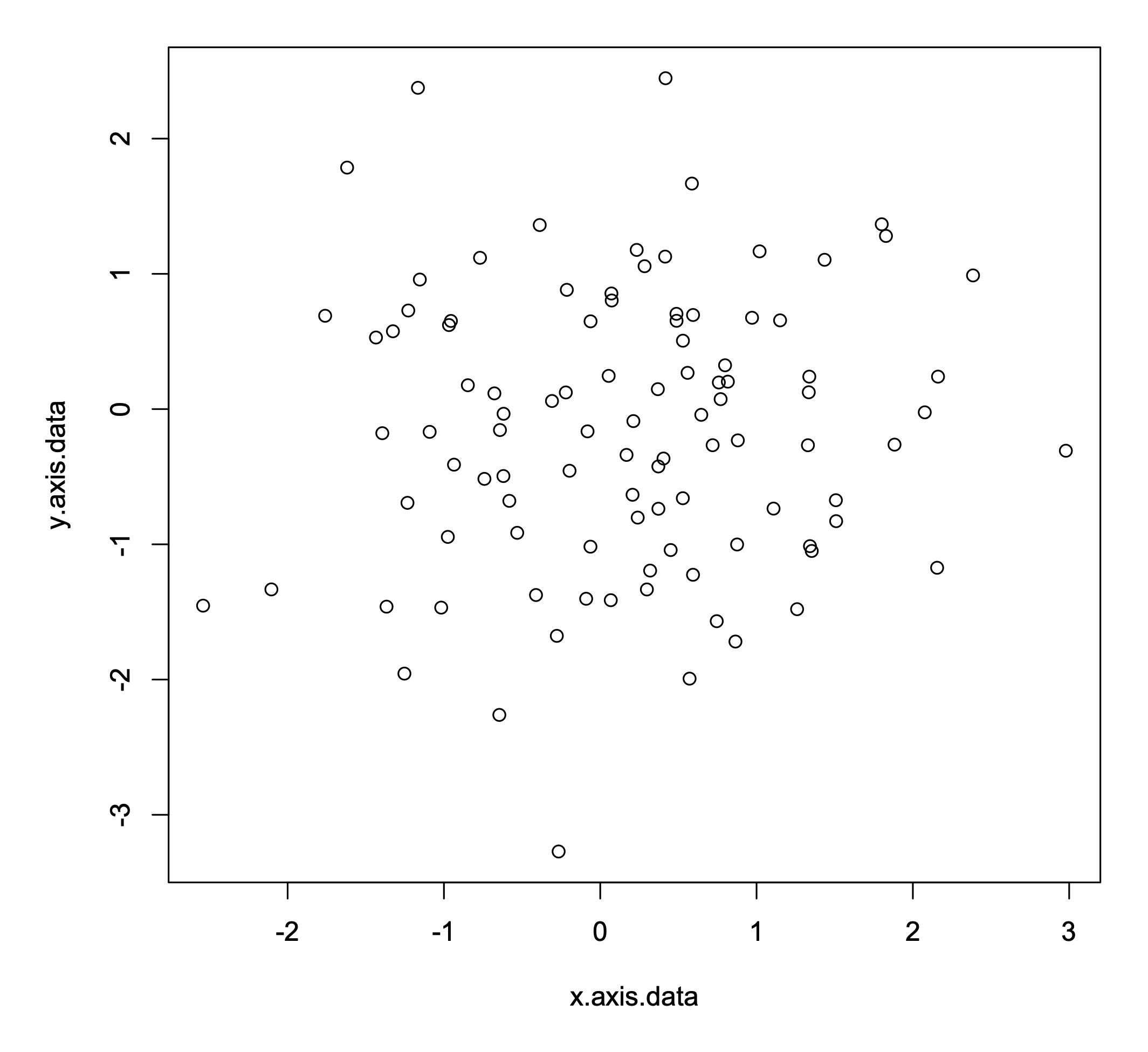
Let’s start by building a simple scatter plot for a set of 100 random data points drawn from a normal distribution. Let’s start by creating this dataset.
x.axis.data <- rnorm(100)
y.axis.data <- rnorm(100)
Making a basic scatter plot is also straightforward in R. You use the command plot() and then put the x axis data first, followed by the y axis data.
plot(x.axis.data, y.axis.data)
In this example, the data generated by R is random, so everyone will get a different graph. However, running the command above in R should produce a graph that looks something like this.
This is a good start, but there is a lot more we can do. For instance, what data is plotted on those axes, and what units are they in? We can add axis labels to give this information to the reader.
plot(x.axis.data, y.axis.data, xlab="Variable 1 (Units)", ylab="Variable 2 (Units)")
You can also add a title if you want to. Graphs in papers and reports don’t usually have titles (they often use a written caption instead), but titles can be helpful when you are exploring a new dataset and need to keep track of lots of plots.
plot(x.axis.data, y.axis.data, main="My Title", xlab="Variable 1 (Units)", ylab="Variable 2 (Units)")
You can do lots of other fancy things as well, such as changing the point character using the pch flag (some options for point shapes are shown here)…
plot(x.axis.data, y.axis.data, main="My Title", xlab="Variable 1 (Units)", ylab="Variable 2 (Units)", pch=4)
…or changing the color of the points…
plot(x.axis.data, y.axis.data, main="My Title", xlab="Variable 1 (Units)", ylab="Variable 2 (Units)", pch=4, col="blue")
… or removing the box around the plot.
plot(x.axis.data, y.axis.data, main="My Title", xlab="Variable 1 (Units)", ylab="Variable 2 (Units)", pch=4, col="blue", bty="n")
As you can see below, by making these relatively small changes, you can alter how the graph looks in some fairly striking ways.
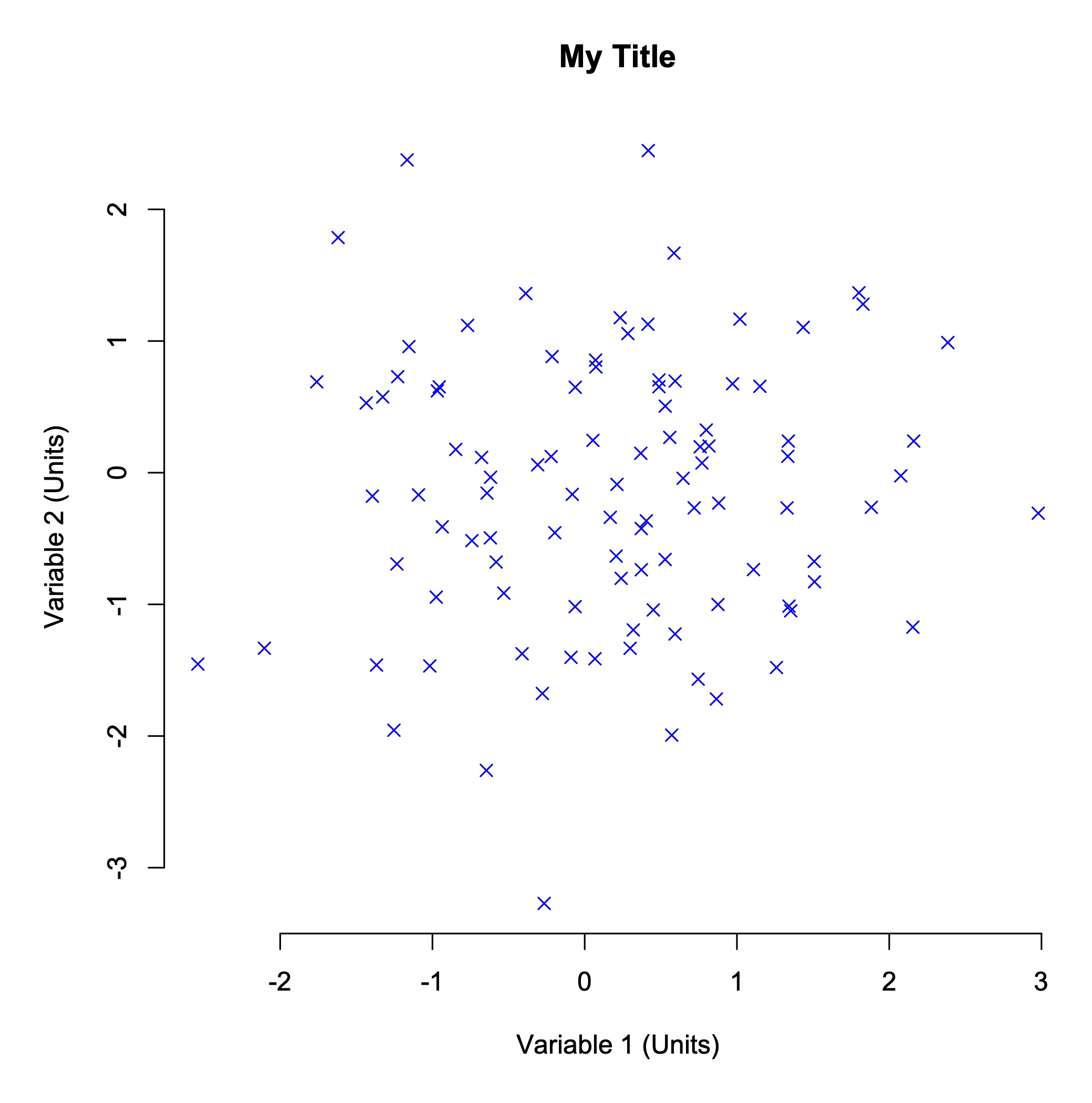
R lets you modify almost every feature of a graph. Although often a simple graph will suit your purposes, searching for example plots online is a good way to get a feel for what alternative designs might be possible and how to make them. The R Graph Gallery is a particularly nice site with lots of worked examples.
EXERCISE 1
Here is code to generate another dataset.
x <- runif(100)
y <- 2 + 3 * x^2 + rnorm(100, 0, 0.25)Let’s assume this dataset shows the production of a metabolite in mg/L (x axis data) relative to the cellular expression of a gene in read counts per million (y axis data). Can you make a scatter plot that clearly and simply shows the trend between metabolite levels and gene expression?
Different Types of Graphs
So this is all well and good if you want to make a scatter plot. But what if you want some other type of plot, perhaps a bar chart?
Well, the R command for a bar chart is also fairly straightforward.
items <- c("A", "B", "C", "D", "E")
values <- sample(seq(0,100), 5)
barplot(values, names=items)
EXERCISE 2
Try running this code to make a bar chart. Can you add x and y axis labels and a title?
And what if you want a pie chart? That’s also easy.
items <- c("A", "B", "C", "D", "E")
values <- sample(seq(0,100), 5)
pie(values, labels=items)
Note that there are small differences between the commands. For instance, to plot group names, barplot uses the names flag, while pie uses the labels flag. You can explore all these flag options by asking for help on the R command line.
?barplot
?pie
There are lots of ways to graph data, including many plot types you have probably never heard of. Regardless of what sort of data you have, there will be many ways for you to plot it. Often, the commands to make these graphs in R are very simple – at least for basic styles.
EXERCISE 3
Take another look through the R Graph Gallery. Choose a plot style that interests you and use the commands given online to make the plot. For this exercise, stick to plots described as base R rather than ggplot2, and unless you have a bit of time to play around, don’t choose anything too complex!
Making Good Use of Summary Statistics
Plotting data can be time consuming, so before we do that, it is often best practice to calculate summary statistics first. This might include measurs such as means (averages) or standard deviations.
Let’s consider a dataset listing the RNA expression of 142 genes together with their associated protein levels, as determined by mass spectrometry. The dataset contains four sets of data generated under four different environmental conditions.
The first thing we need to do is load the dataset into R.
load(url("https://github.com/mpcox/203.311/raw/main/Week3/files/expression.Rdata"))
In this exercise, let’s plot the gene expression data on the x axis. This information is stored in variables called ‘set1.x’, ‘set2.x’, etc. Plot the protein level data on the y axis. This information is stored in variables called ‘set1.y’, ‘set2.y’, etc.
Means (averages) are easy to calculate in R.
mean(set1.x)
mean(set2.x)
mean(set3.x)
mean(set4.x)
EXERCISE 4
Calculate the mean values of both the gene expression data (e.g., set1.x) and protein level data (e.g., set1.y) for the four sets. Do gene expression or protein levels appear to differ under the four environmental conditions?
Standard deviations are also easy to calculate in R.
sd(set1.x)
EXERCISE 5
Calculate standard deviations for both the gene expression and protein levels for the four sets. Again, do gene expression or protein levels appear to differ under the four environmental conditions?
Finally, it can be helpful to calculate correlations between pair of variables (here, gene expression and protein levels). A correlation analysis will tell you whether, for instance, genes with high expression of RNA also have high levels of the corresponding protein.
You can calculate correlations in R using this command.
cor.test(set1.x, set1.y)
This returns a lot of information, but the most important numbers are the correlation value (cor or r) and the probabilty (p-value).
EXERCISE 6
Calculate correlations of gene expression against protein levels for the four sets. Are RNA expression levels helpful in predicting protein levels? That is, are expression and protein levels significantly correlated?
By this time, you have probably identified that the four sets of data are very similar, in terms of their expression and protein levels, regardless of which environmental conditions they were generated under. Interestingly, the correlation values are also small – there is little evidence in this data that genes with high RNA expression also produce high levels of the corresponding protein.
Just to confirm this, it’s a good idea to plot your data, if only to check that there are no real differences between the datasets.
EXERCISE 7
Make scatter plots for the four datasets. Plot gene expression (e.g., set1.x) on the x axis and protein levels (e.g., set1.y) on the y axis.
Choosing A Plot Type
It’s often a good idea to look at your data visually. The challenge is: what plot type should you use? After a while you begin to learn what styles of plot are most well suited for representing certain types of data. Even then though, you often just have to try different plot types and see what works.
Let’s consider biological items grouped into functional categories, such as ‘immune genes’, ‘enzymes’, ‘cell wall genes’ and the like. Classifying things in this way is very common, and looking for differences can be highly effective in distinguishing how certain types of genes change under various conditions (say, in cancer cells versus normal tissue).
Here is a dataset of five immune cell types and their percentage frequency under three conditions: normal tissue, the primary tumor, and a secondary tumor (‘metastasis’).
cell.type <- c("eosinophils", "mast cells", "lymphocytes", "basophils", "neutrophils")
normal <- c(17.5, 21.5, 20.0, 17.0, 24.0)
primary <- c(20.0, 21.0, 19.0, 20.0, 20.0)
secondary <- c(21.0, 18.5, 20.0, 23.5, 17.0)
EXERCISE 8
We learned how to make pie charts earlier, so make pie charts for the normal tissue, primary tumor and secondary tumor. Are there any clear differences in the proportions of the five immune cell types? You may need to save the plots to compare them.
Because it’s hard to know what plot type will produce the clearest visualation of your data, it is often helpful to make different plots and see if you like them better. For group data, bar charts are a common choice.
It is also often convenient to re-order your dataset – this can make it easier for your readers to follow the results. Here, let’s move the immune cell types around so they’re in alphabetical order.
cell.type <- c("basophils", "eosinophils", "lymphocytes", "mast cells", "neutrophils")
normal <- c(17.0, 17.5, 20.0, 21.5, 24.0)
primary <- c(20.0, 20.0, 19.0, 21.0, 20.0)
secondary <- c(23.5, 21.0, 20.0, 18.5, 17.0)
EXERCISE 9
We learned how to make bar charts earlier, so make bar charts for the normal tissue, primary tumor and secondary tumor. Do the pie charts or the bar charts present the data more clearly?
Critically Evaluating Your Data
Way back in 1980, when spandex and mullets were the height of fashion, Robert Jackman wrote an influential paper. Jackman was looking for links between social factors and income across a global range of countries. Although this study is now over 40 years old and it is not genetic data, the analysis is a widely known case study of how to look critically at data. We’re going to use it for that reason.
Let’s start by loading the dataset.
load(url("https://github.com/mpcox/203.311/raw/main/Week3/files/income.Rdata"))
This dataset contains two variables across 18 countries: the percentage turnout at national elections (turnout) and the average level of inequality in people’s incomes (income.inequality).
EXERCISE 10
We learned earlier how to calculate correlations. Take this dataset and calculate the correlation between voter turnout and income inequality.
Hopefully you found, as did many many researchers before Jackman, that there is a strong negative correlation between voter turnout and income inequality (r = –0.78, p = 0.00013). Because the probability value is low, we would say that this is a statistically significant result. Specifically, it tells us that countries with a high voter turnout have less income inequality than countries with low voter turnout.
EXERCISE 11
So now let’s do what Jackman did. Make a scatter plot of voter turnout (on the x axis) versus income inequality (on the y axis). What do you see?
One country – it happens to be South Africa – stands out as being very different to all the other countries. In statistics, this process of looking for unusual data points is called anomaly detection, and on this graph, South Africa would be said to be an outlier. It is important to think critically before removing data from any analysis – doing that can effectively force the data to look the way you want it to rather than the way it actually is. However, this plot is a good example of where a single point looks suspicious. It would be quite reasonable to ask whether you get the same result if you just consider the countries other than South Africa. If there is genuinely an association between voter turnout and income inequality, the correlation you calculated above should still hold up.
So what does the correlation between voter turnout and income inequality look like when we exclude South Africa?
First, we have to tell R to ignore the South Africa data point. Conveniently, South Africa is the first entry in each variable. Because these are just vectors of numbers, we can simply ask R to exclude the first country and only consider countries 2 to 18. The following command shows how to do this in a way that R will understand.
cor.test(turnout[2:18], income.inequality[2:18])
EXERCISE 12
Calculate the correlation between voter turnout and income inequality, excluding the South Africa data point. Has the correlation changed, and if so, how? What does this result mean in a real-world sense for the relationshp between voter turnout and income inequality globally?
Checking Your Data Source
As you’re hopefully now beginning to realize, it’s always really important to check your data.
Consider the following time series dataset.
year <- c(1999, 2000, 2001, 2002, 2003, 2004, 2005, 2006, 2007, 2008, 2009)
transposon.gain <- c(6, 5, 5, 10, 8, 14, 10, 4, 8, 5, 6)
transposon.loss <- c(9, 8, 11, 12, 11, 13, 12, 9, 9, 7, 9)
This shows the number of transposons gained and lost from the genome of a New Zealand alpine buttercup as a population on the Ruapehu plateau was surveyed over the course of a decade.
EXERCISE 13
Calculate the correlation between transposon gain and transposon loss. Are these two features associated? What biological processes might be causing the association?
For time series data, it can often be helpful to add lines linking points on a plot, in order to show trends through time. There are two alternative ways to do this in R: using the type flag or the lines command. The options for the type flag are p for points only, l for lines only and b for both points and lines. Run the commands below and see if you can figure out how they work.
plot(year, transposon.gain, type="b", col="blue")
lines(year, transposon.loss, type="b", col="red")
EXERCISE 14
This dataset was obtained from an online data repository. Quickly look up the website and just check that the dataset was downloaded correctly.
P Hacking
By now, you should have a growing understanding of how important it is to check your data, question your assumptions, and think critically about your decisions, including how you choose to explore and visualize your data.
In this final exercise, we will look at the issue of p hacking. P hacking is the name given to the very tempting process of looking through your data until you find a significant result. When datasets were small, researchers could really only ask one or two questions. Those questions were either supported by the statistics or they weren’t. However, now that many studies are collecting huge amounts of data, if your first question doesn’t hold up, it is tempting to keep looking through the dataset until you find an interesting result.
EXERCISE 15
Take a look at this website. Select various parameters to test. Can you find a statistically significant result that you like? Can you disprove a result that you don’t like, just by tweaking the analysis. How much do you believe either outcome?
Take Home Messages
During the course of this practical, you have hopefully encountered a few ideas that are new to you. Some of the main take home messages are:
-
You can make all sorts of graphs in R, often easily, but you need to think very carefully about how your readers will interpret the graphs you give them. Some types of plots are just always worse than others. (I’m looking at you, pie charts).
-
You need to be confident about where your data comes from. Is it accurate? Is it complete? Have any errors crept into the dataset before you got it? Do you trust the source?
-
You should always look at your data carefully and critically. Does your data make sense, given how the experiment was set up? Do any features of the data look suspicious? Are there any outliers? Even if the summary statistics look fine, plot your data to check for unexpected features.
-
You should develop a habit of thinking about what analyses you want to run before you start them. The human brain is very good at finding patterns even where there are none. Are you using your data to answer specific pre-defined questions, or are you just looking through your data until you ‘find something’?
If you put all these points together, the key upshot is that you need to think critically as you analyze data. Simply throwing together a plot can get you into trouble quickly. Spending the time to think through what you’re doing, and why you’re doing it, will save you a lot of pain down the track. Even if your graphs don’t confuse you, it’s really important to make them in such a way that they don’t confuse others either.
Further Reading
If you are interested in this subject and want to learn more about good visualization techinques, the following two books are freely available online.
Kieran Healy. 2019. Data Visualization: A Practical Introduction. Princeton University Press: Princeton.
Claus Wilke. 2019. Fundamentals of Data Visualization: A Primer on Making Informative and Compelling Figures. O’Reilly: New York.